,
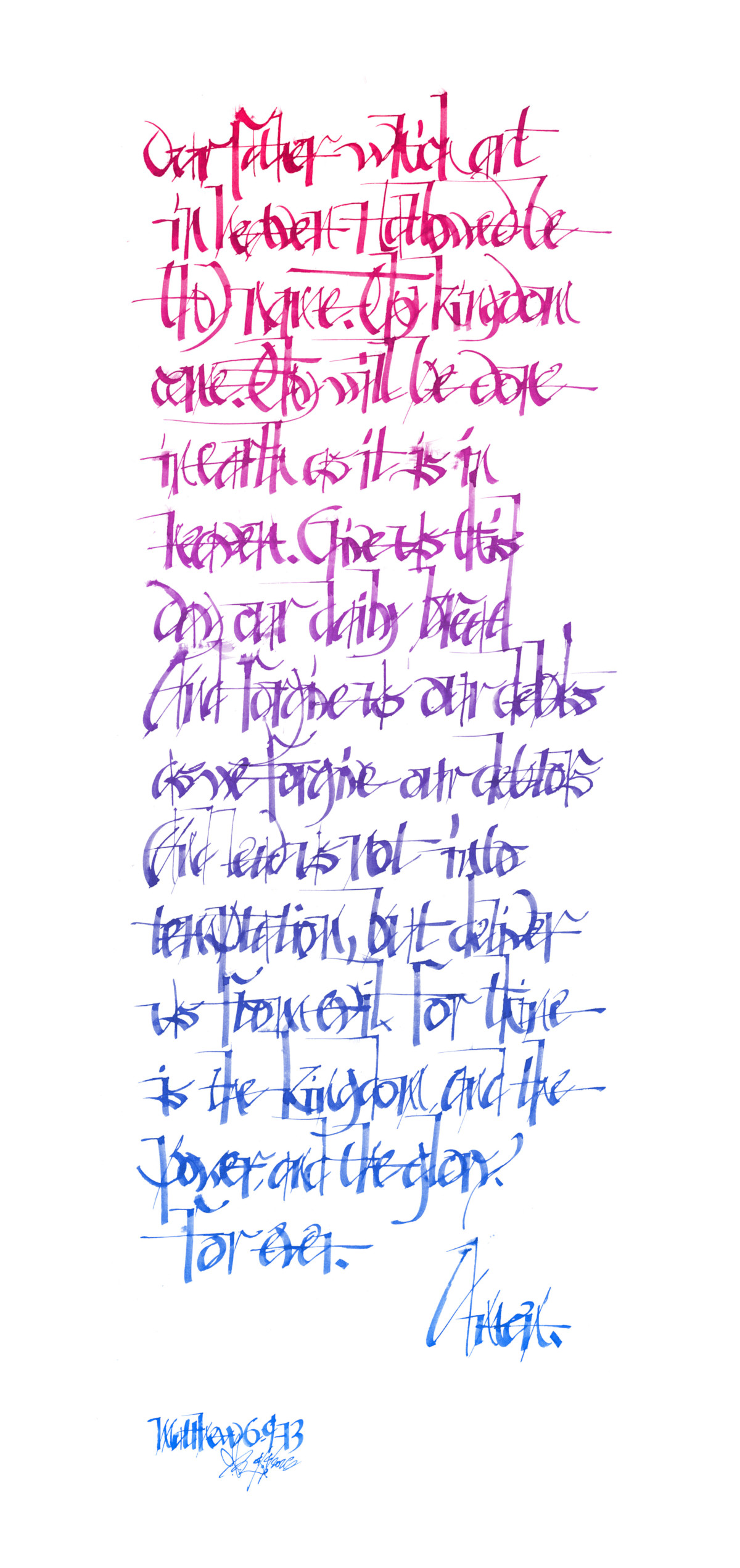
This week I started playing with a variant of Gothicized Italics where part of each letter is written with the hairline edge of the pen. It’s a bit of Edward Johnston slamming into graffiti scripts.
Unfortunately, this hand is not easy to read. Then again, a couple of years ago, I had an epiphany that legibility is overrated.
I’m really digging the contrast of thick and thin. It brings me back to the old days of hand drafting, with thin verticals and thick horizontals, though I’ve had to retrain that preference since standard calligraphy is the opposite with thick verticals and thin horizontals.
It’s a joy to write, especially at full speed. I suspect it’s a bit like talus running, though I don’t have the courage to risk life and limb on high octane activities—such excitement is confined to my home studio.
,
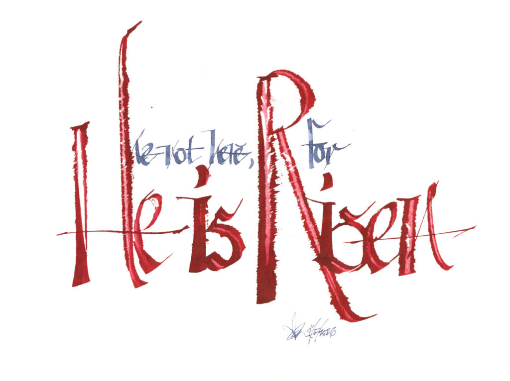
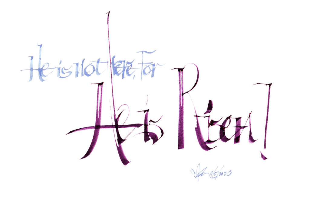
And here are a couple shots for Easter.
,
Cheers!