Into the final stretch!
,
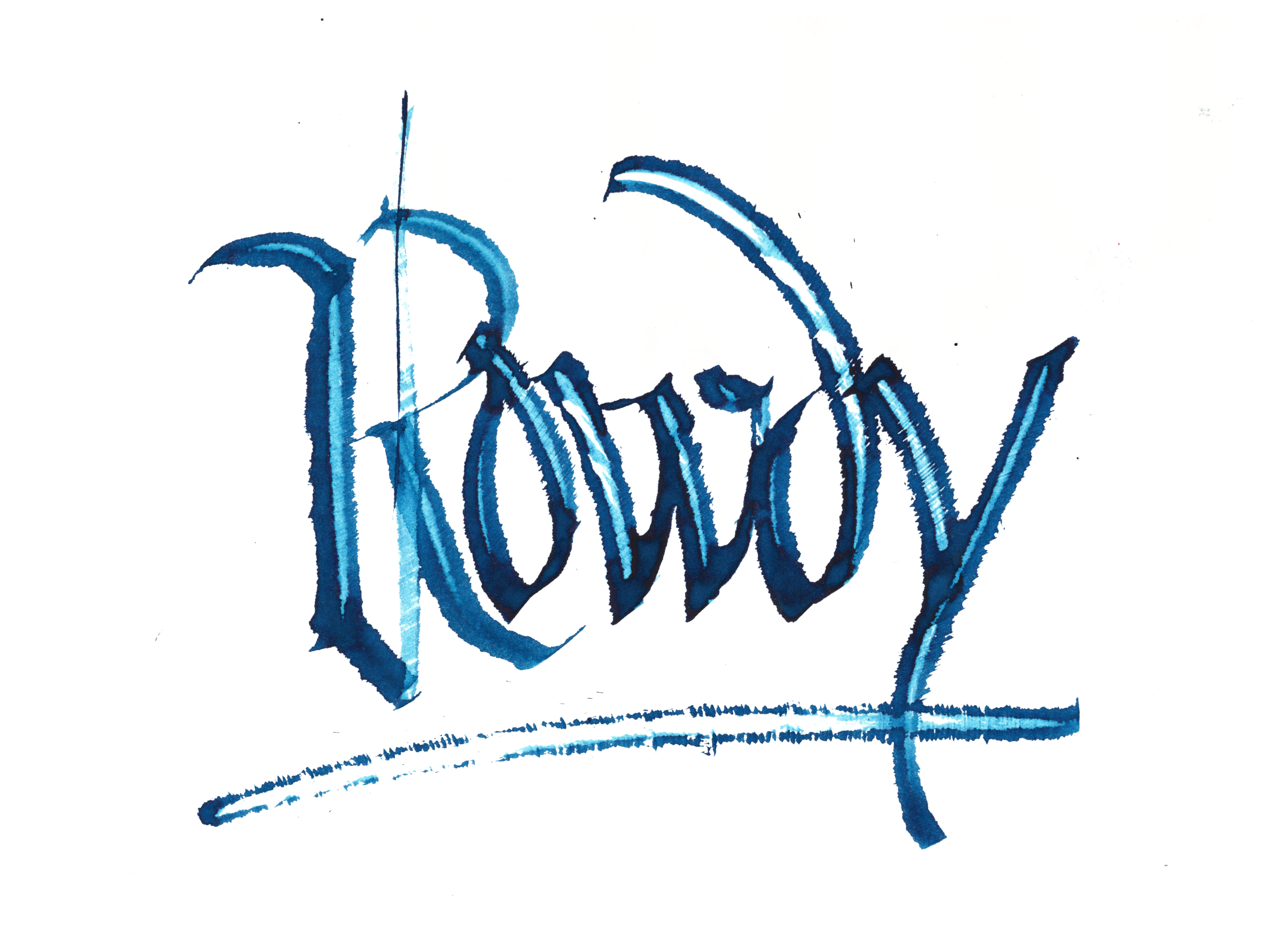
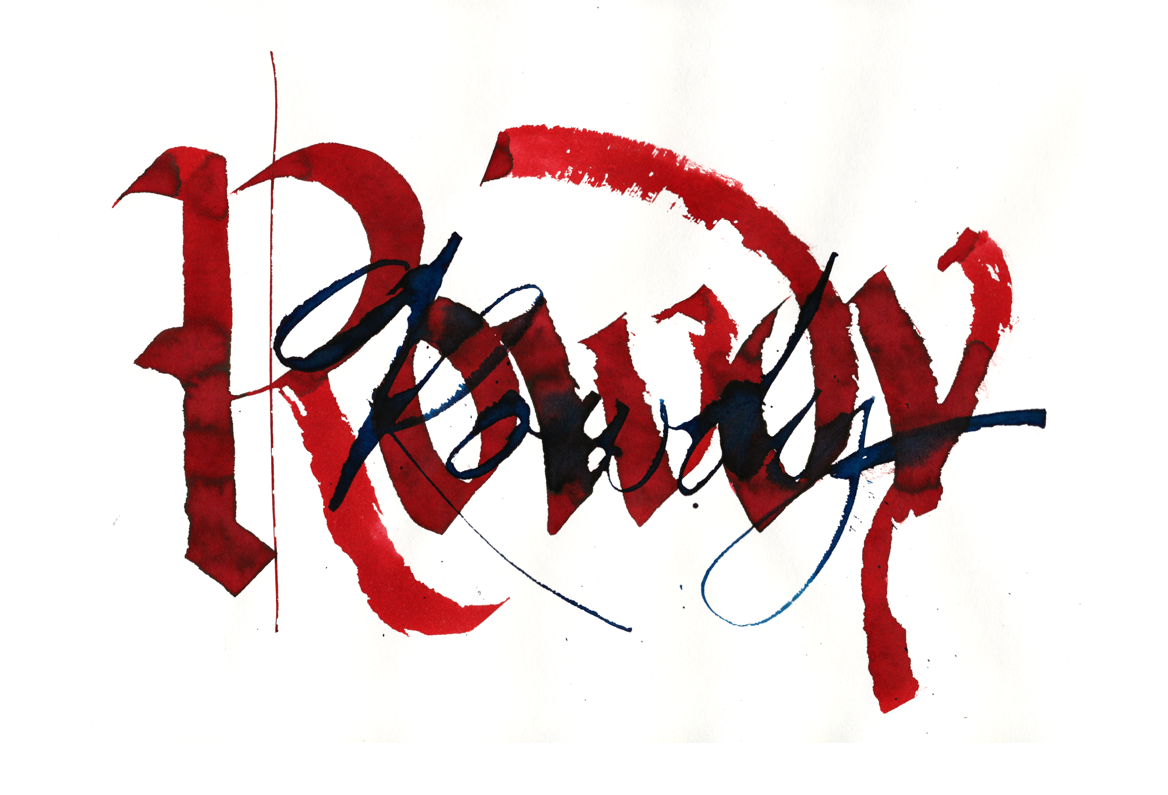
Rowdy
The gothicized italics was nice, but lacking. So added an extra layer.
,
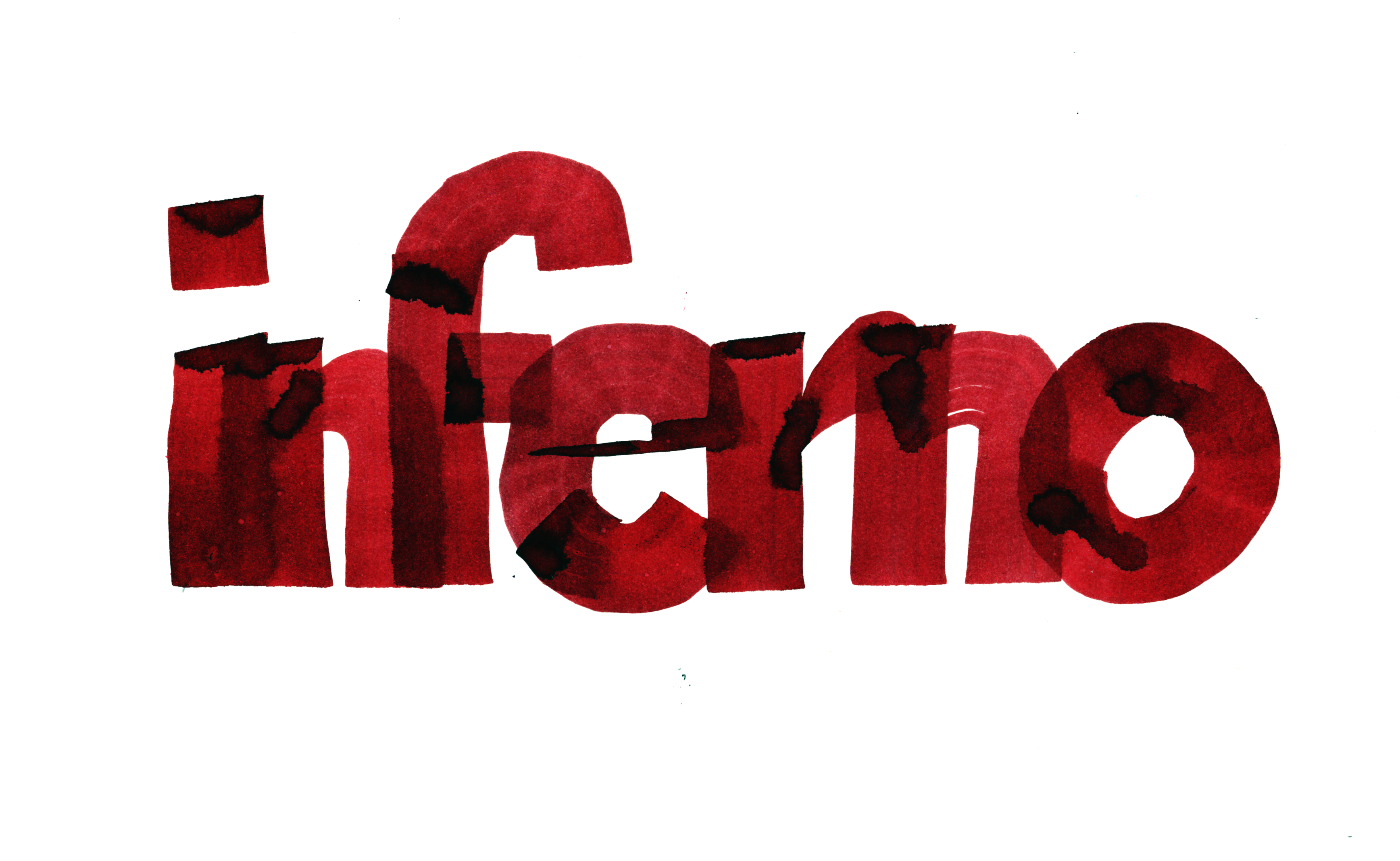
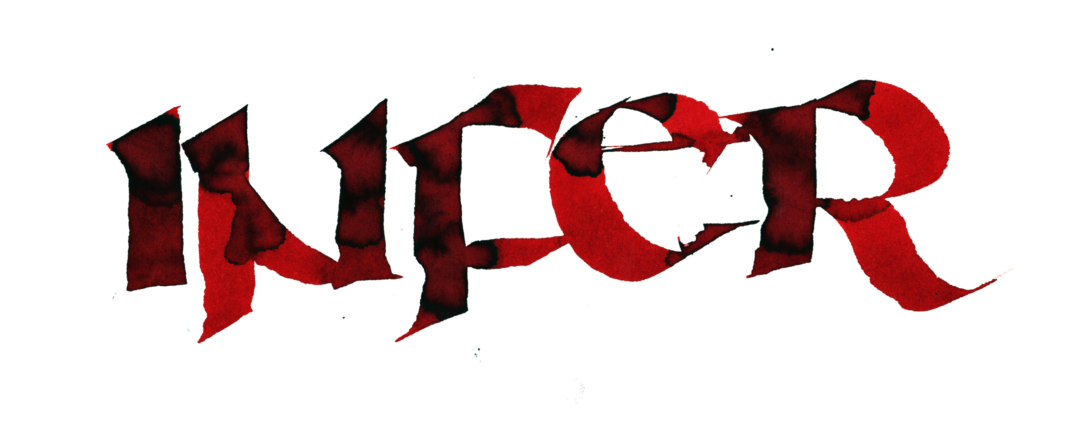
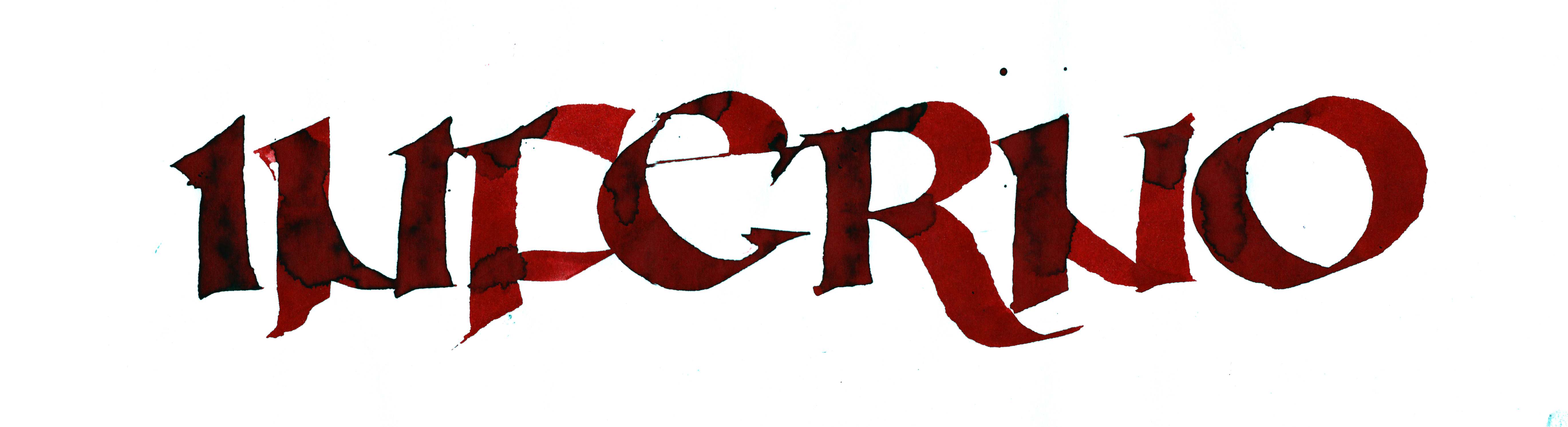
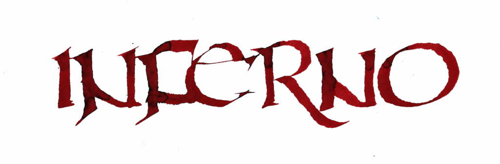
INFERNO
As a longer word, I slammed it together, but it didn’t feel right.
So I went in the opposite direction with uncial, a wider script. Even though the aspect ratio makes the final one look small, it’s actually from a long 6×18 sheet.
,
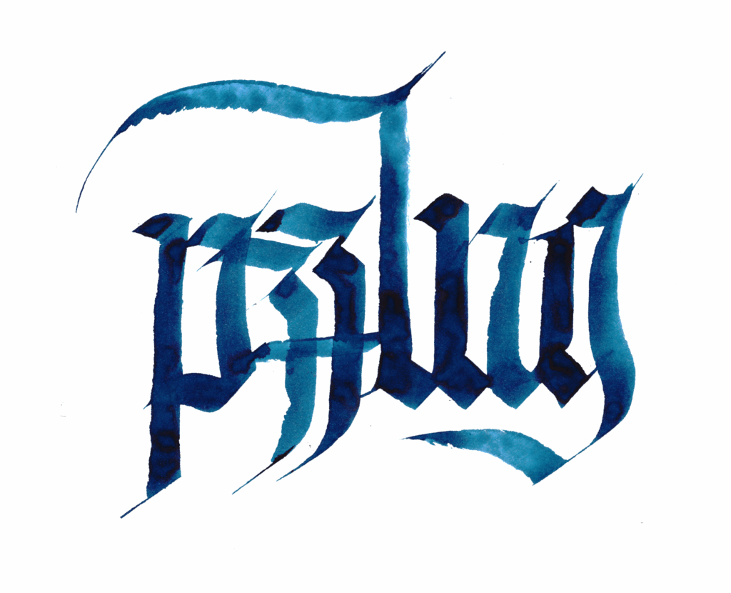
puzzling
Another tricky word. I dropped the vowels (saving width on the page) and went with gothic, which emphasizes vertical strokes at the expense of legibility, hiding the missing letters.
,

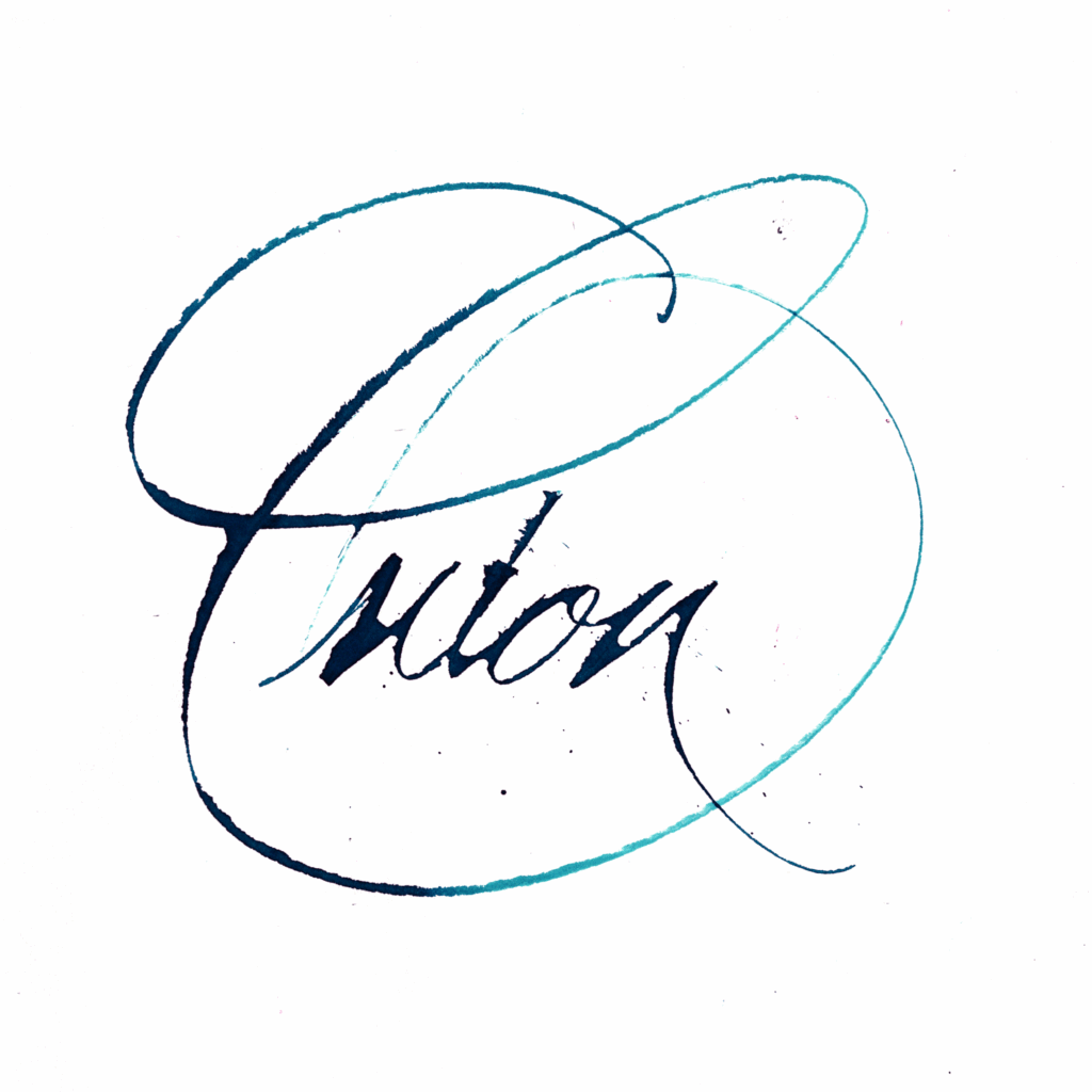
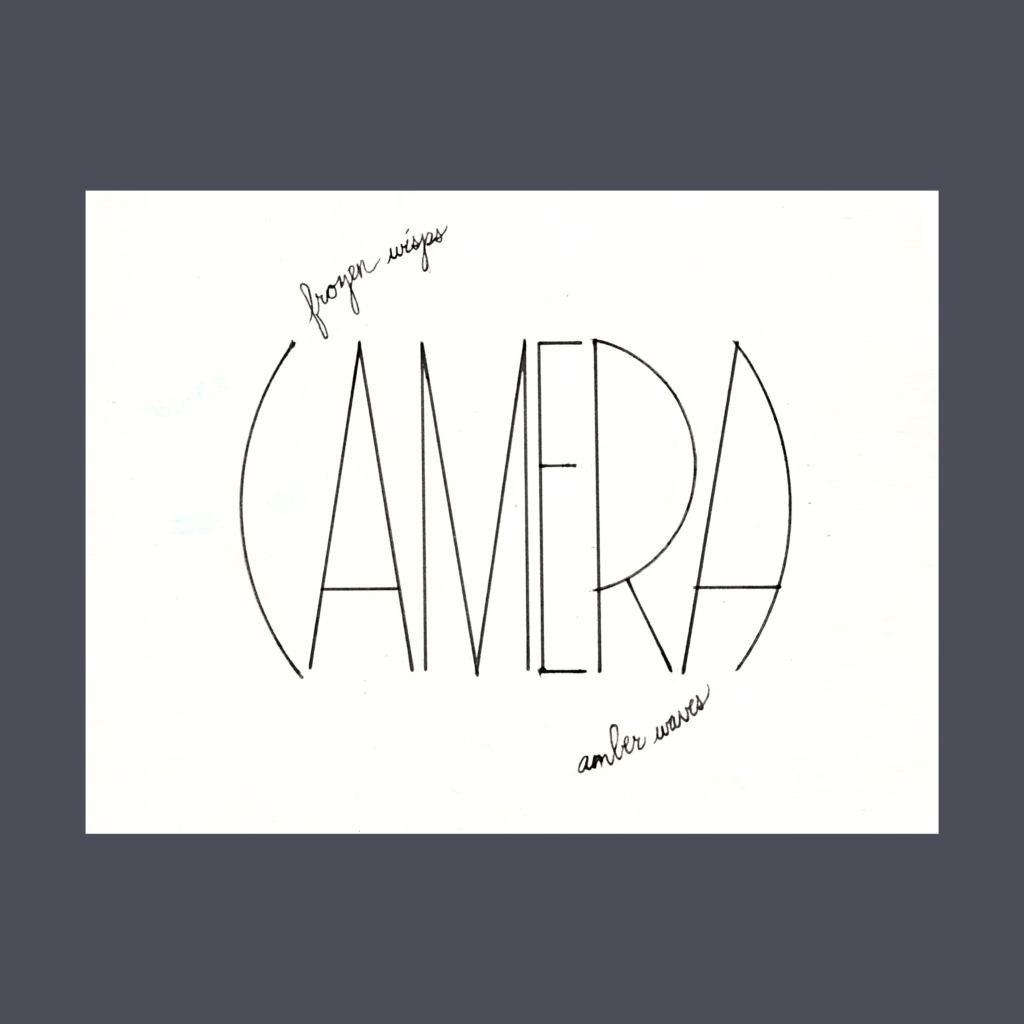
Onion
I might have been able to get the top version to work with a compass and straightedge, but I wasn’t feeling the effort, even though camera is one of my favorite pieces from last year.
So back to ruling pen cursive! I have several versions of this that I’m all fond of. I picked this one because the nion felt very comfortable inside the O.
,
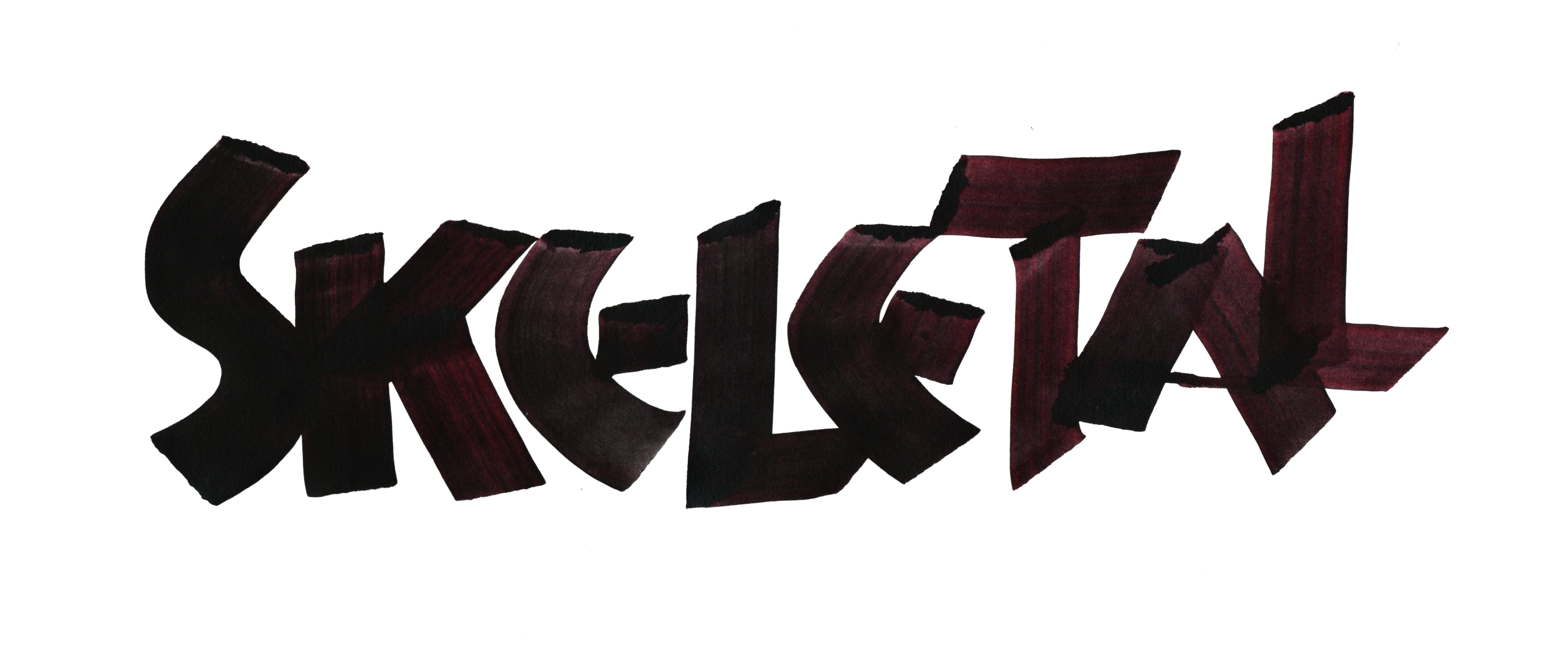
SKELETAL
After a couple horizontal tries, I realized this word wants to go vertical. After inverting arctic and seeing how it could be pushed to make overlapping letters more legible, I realized that it was even more applicable here!
,
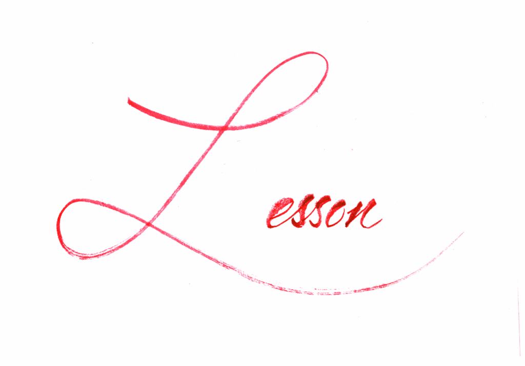
Lesson
I love the simple swooping capital cursive L.
It took a few tries to get right…turned out that I needed a guide line to keep esson lined up properly. I usually just wing it, but this was not one of those pieces.
,
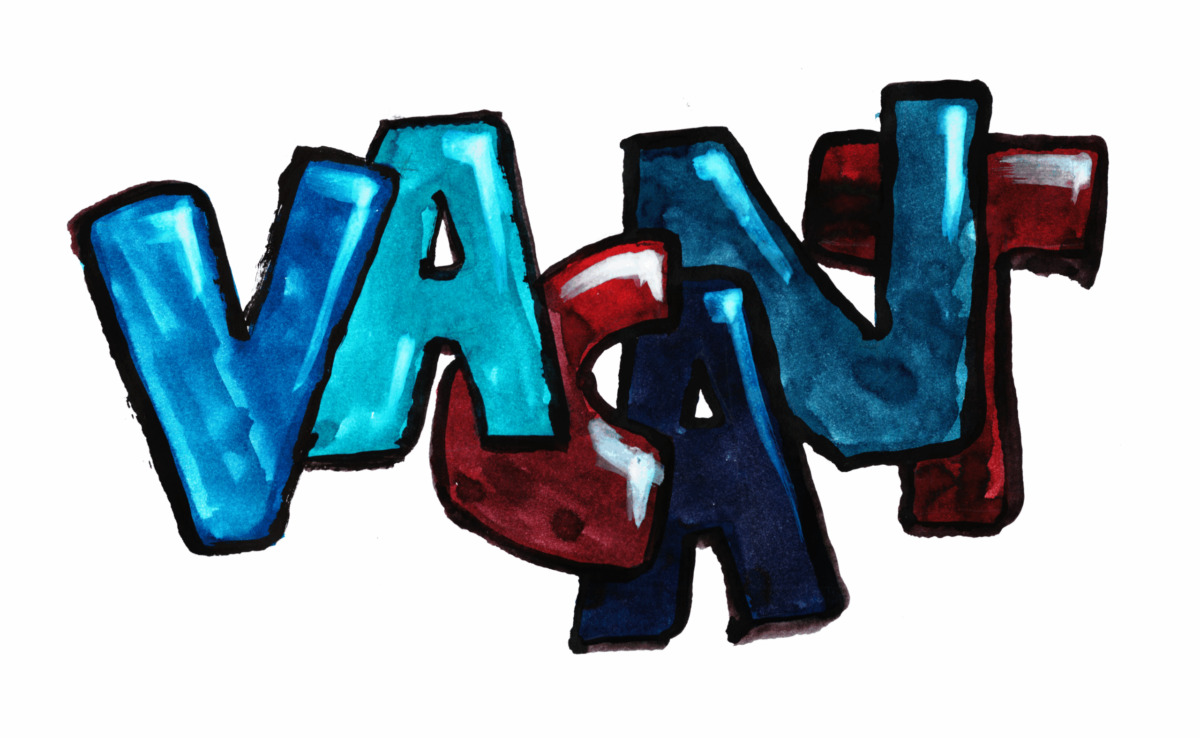
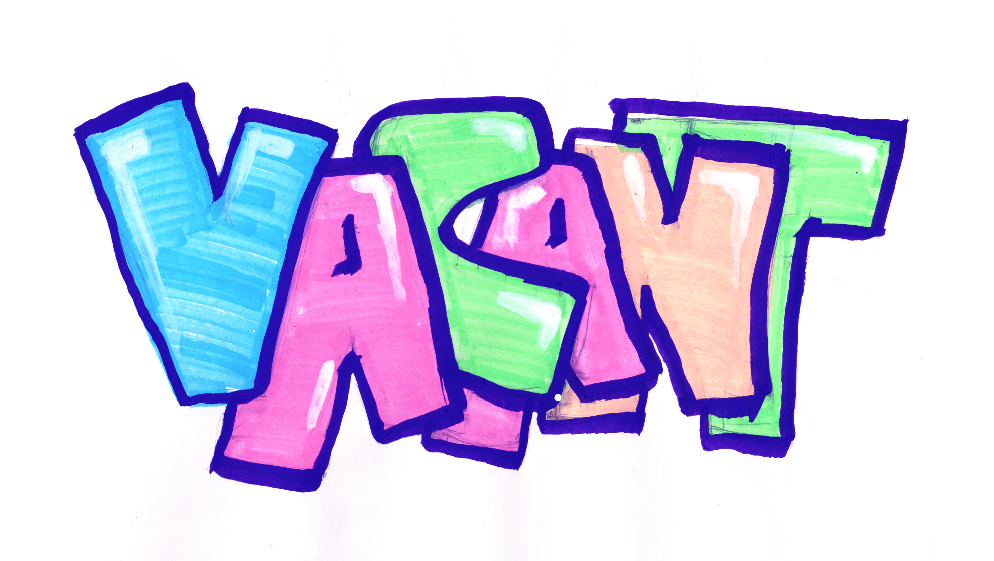
VACANT
I’ve been wanting to work in versal and the V got me thinking of this script that draws out the letters. But Roman Capitals weren’t the right fit so I dove into my book on graffiti.
I just realized the relationship between graffiti and vacant lots. Maybe it was hiding in my subconscious, but at the time I just felt this script looked bubbly and I had run out of ideas.
For the second version, I borrowed the the girl’s Posca markers from last Christmas. I might buy another pack this year.
,
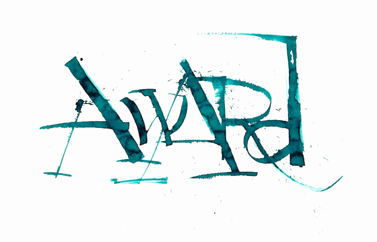
AWARd
I wrestled with this graph, until I switched to a lower case d.
It seemed fitting to close Inktober with another splatter, after a summer dominated by the ruling pen.
,
I always think that finishing a project will feel triumphant.
It never does. It’s always ends a whimper.
On to the next one.
Cya next time!
,
PS—Over the Moon, John Kahrs, Glen Keane, 2020
Good, mediocre, and bad.
The animation was nice, and it was great to see Asian faces. Unlike Mulan, the faces felt real and detailed. The family dinner scenes with the aunts and grandparents were as real as one could hope for in this idyllic country town. Yes, both moms were airbrushed, but the animators really put real soul into the ancillary characters.
Unfortunately, for all the good animation, the story was mediocre. This wasn’t a cheap knockoff, but it wasn’t a top-notch Disney imitation either. Classic Pixar would blatantly telegraph its game and still manage to tug your heart strings. Then again, Disney hasn’t been very good at imitating Disney for the past decade.
This movie has a similar structure to Coco, but it’s just clunky. They blatantly unalive Mom#1 in the first song. The songs and dance routines are inserted awkwardly. The other world seems gratuitously wacky. Along the way, they basically unalived suspension of disbelief.
Oh and, her dad did an awful job trying to blend the family. Dropping the news on the daughter right before a big family event. Geez.
—September 2021
,
PPS—The Painting, Jean-François Laguionie, 2011
This movie isn’t subtle as an allegory of God asleep at the wheel with the cold heartedness of mankind. But it’s still a good adventure, with love, exploration, justice, and ultimately freedom.
In spite of its straightforward messaging, it charms in a way that American animation fall flat. The early Pixar formula was great, but it’s predictable to the edge of dullness.
Even though this isn’t that avante garde, it’s fresh air in America. And the art is great with a bold painting style that contrasted against the CGI of the painter’s studio. Everything has been done, and this story’s tropes aren’t new. But the combination with the art direction make this a movie a fine 90 minutes.
—October 2021
,
PPPS—Tales of the Night, Michel Ocelot, 2011
This is a fun collection of short stories with the main characters in silhouette. In a world before Into the Spiderverse, anything that wasn’t the same 3D blob felt unique, and the flatness of the papercut characters made the backgrounds shine bright.
The movie raises the thorny question of cultural appropriation. I suspect it’s a hotter issue in American than France—referencing another culture might be more fraught in a pluralistic society. But over the past few years, I’ve decided that we should let storytellers set their stories in a diversity of fictions. They are taking a risk when they venture outside their known world, but that’s their problem. Why should I force them to stick to exactly what they’ve experienced?
And maybe the heightened sensitivity around cultural appropriation is a holdover from the mass-culture era. As media becomes diffuse and publication becomes democratized (even as the algorithms have become monopolized), it’s hard to feel strongly about any specific cultural product. If it fails, ignore it.
The culture is no longer mass. It’s a series of short stories connected only in our internal stage. Just like this movie.
—November 2021
,
PPPPS—Practice
.